Sunday, May 22, 2011

Comments from Experiment 2 - Strengths and Weaknesses.

Hi all.


The performance across the tutorial group was not too bad but there is a need to be more concerted in the addressing the aims of the experiment outlined always in the marking schedule and the brief in the course page.


Whilst almost all students showed competence in learning and applying digital and manual methods of drawings and visualization, there appeared to be some ambiguity in terms of the way in which the labs were articulated.


For most students, the electroliquid aggregation did not develop/transform/change much when put into Crysis environment. Also, most students underplayed the role of the platform and the manner in which the platform is approached and links the two labs in distinctive ways. The element of detail was missing or not pointed out in almost all submission.


There were only few students who showed much adeptness with re-crafting the default/generic landscape in Crysis. Furthermore, the submissions could have been improved overall by undertaking a clearer blog presentation - One needs to think of recomposing their works into story boards or panels rather than use the blog format as free flowing sequential form of uploading.


Keep all this in mind for the next submission.


With thanks,


Anu


Ed

Thorough and systematic design method; cohesiveness between the conceptual (hypotheses) and formal (prisms) and substantive illustrations to back this up is evidenced; rigorous and methodical documentation is also commended.


Dean

This was a near complete submission but it lacked enthusiasm and the responses were perfunctory. The submission could have benefited from a greater sense of formal exploration, and engagement with the aims for this experiment.


Michelle

Complete blog, Strong and sensible investigation of the hypotheses, aggregation and outcome and the ability toe articulate that - Attention to moulding the landform is evidenced.


Bryan

Thorough submission; A good grasp on the three dimensional composition; Attention to land form. However the scheme progresses hypotheses that do not make a lot of sense in terms of activities and therefore their connection to the built form is not always meaningful. The meeting point does not articulate an encounter or sharing; the textures do not read as continuous or discontinuous sets of intensities. Nevertheless, the descriptions show that there is an ambition to connect idea and form even if the hypothesis is unworkable.


Anthony

Strong grasp of the connection between hypotheses and forms; attention to land form and the manner in which this informs the crafting of the forms and their use; the image captures could improve as they are sometimes from strange view points – try to pick one or two aerial, one under the form and the rest at eye level; Good axonometrics.


Hayden W

Strong image captures; Attention to landform and its engagement with the forms; Excellent axonometrics and textures; the electroliquid aggregation is competent but these do not adequately tell us about the labs and the meeting space; Like other submissions, this one does not announce a distinctive arrival to the platform.


David

Textures are competently handled; the final electroliquid aggregation is sensible; However the three electroliquid aggregations and their parallel projections have not been attempted? The amalgamation of prisms is mechanical and their combination is neither dynamic nor tested and explored; the insertion of the 3 d object into Crysis environment is not explored in terms of placement and crafting of the landform.


George

The axonometric explorations could have been stronger in terms of drawing techniques; and the textures could have been better drawn; The three electroliquid aggregations and their parallel projections have been attempted but primitive and incomplete; However, the distinctiveness of the labs, atmospheric quality, and the embedding of the forms into a created landscape is commended., and the image captures are quite effective.


Amy

The submission is well handled and strong progress from Experiment 1 is evidenced; the connection between the finalelectroliquid aggregation and the prismatic combination is lucid; landform could have been reworked to a greater detail as could have been the connection to the built form; The stairs are an interesting element but their derivation as a detail has not been articulated; The nature of the actual labs and the meeting space should have been explored.


Dominik

The electroliquid aggregations are depicted but unsupported by hypotheses; the labs have been considered in relation to their clients but the platform or the third space has not been indicated; attention to landform is evidenced but fairly conventional; detail elements have not been developed


Patrick

Blog composition ought to be considered a form of submission that needs some thought and craft and imagination in handling;Textures needed improvement;However, significant attention has been paid to the crafting of the landscape and the manner in which form sits into it and the way in which the clients approach this structure; The exploration of axonometrics is also competent as are the electroliquid aggregations; The submission could have been dramatically improved by improving image captures and combining them with text either as captions or as annotations


Robert

The textures could be improved; All parts have been attempted; The text in the blog attempts to connect the electroliquid aggregation with the prismatic combination but their development into labs distinctive from one another is not consider and neither is the meeting space or the third space.; Text should find its way into annotation and descriptive captions rather than being left as a paragraph.


Matt

Image captures are okay; But the movement between labs is not demonstrated or explained ; Textures are confusing as some are manually drawn while others are digital and they dont really work as a whole set; The three electroliquid aggregations with the corresponding hypotheses are missing so it is an incomplete submission! The hypothesis driven axonometrics (12) are missing. The image captures are okay but they are all external shots which also reveals that the composition is not inhabited and/or traversed –Ideally you would have shown shots of the labs, the adjacent areas, access to, movement in between labs, and the third space which connects it to the landform – Your composition mostly sits on the landform – A lot more exploration would have strengthened the submission.


Freddie

Competently handled submission and all complete except that the 3 experiments or the electroliquid aggregations did not have reworked hypotheses; and the textures are completely missing the mark; Apart from that the submission shows attention to arrival and the landform as it connects or disconnects from the prismatic composition; the only shortcoming is that most of this is form based and external and the submission could have been strengthened by including more eye level shots (gaming level) to allow the viewer to engage with what it would feel like to move around this structure.


Daniel

Need more skill in handling textures and building competence in hand drawing; Image captures are fine and the submission begins to note the distinctiveness of one lab from the other and the movement between but without pointing out which lab belongs to whom and how these clients arrive to their labs; More skill and effort needed generally; the blog is awkwardly composed – this could win or lose marks for you; the three electroliquid aggregations complemented by reworked hypotheses is missing. Please check marking schedule next time.


Alyse

The textures are an interesting set; Concerted effort into crafting a land form and atmosphere to connect with the prismatic composition; Overall a really well handled, explored, documented submission throughout. Can be improved through clearer annotation and making panels/boards for each part of the submission rather than leaving it a series of continuous blogs, and by focussing on interior shots and shots at different times of the day.


James

Overall okay submission; but the image captures or the descriptions/captions do not enter into a discussion about the form of the two labs and how the two clients meet each other and where, and how this connection to the landform is significant or meaningful; Textures are okay but maybe a bit sterile – Try to combine the tactility of hand drawing with computer aided drawing


Hayden C

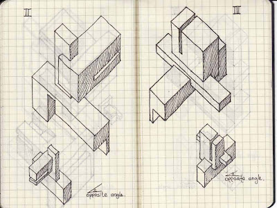
The textures don’t really hit the mark in terms of competence in drawing; the 3 electroliquid aggregations as hypotheses are not discernible even though they are explored as axonometrics ( I think); the remaining twelve (6X2) axonometrics do not even have hypotheses associated with them; the forms do not indicate the labs or the meeting point or even who they belong to; The hand drawn axonometrics are okay but they are not overly competent in terms of a deliberate strategy for adding/subtracting/colliding rectangles; The Crysis work is not bad though; The whole submission could have benefited from engagement with the studio process and by methodically following the aims of Exp 2 (as outlined in course documents).


Frank

Beautiful textures; Well presented; All explorations well documented and explained; Final scheme is well explored in terms of the form of the labs, how they connect to each other and the landscape, and there is a strong sense of interiority as well as exteriority as well as mass; Crysis work is competent and makes the scheme very legible.


Tuesday, May 17, 2011

Habitable Bridges

http://www.zaha-hadid.com/offices-and-towers/habitable-bridge-over-the-river-thames

Student entries for the Dialectical Bridge.


Experiment 3 - Thinking through

Architecture consisting of three spaces

Two offices plus an elevator - So they ought to be at least be completing and complementing each other as a full piece of architecture - Composed of static and dynamic parts

Choose a specific business from two of the three clients listed above and create an architecture consisting of three spaces

Think of a specific 'business' by ascribing a verb or a programme to it - Such as marketing, research, recording, performing, publishing and so on

Two of the spaces should be located in a bridge that spans a valley.

Think of the manner in which the spaces interact or not interact with each other - Do they physically or visually connect and/or disconnect and why

Also, as the piece of architecture is a bridge, access or the manner of arriving at the offices would be key so think of whether they arrive from either ends or both ends or do one or both of the elevators contribute to the arrival and departure from/to the offices from the valley floor or is the arrival from the valley only?

Design two elevators to transport your clients to the meeting space and a table around which to meet that reinforces or challenges your particular understanding of "Power".

Think of where these elevators emerge from top or bottom or is this part of the same composition which then dismantles into two elevators?


Saturday, May 7, 2011

Week 10 Tutorial

Dear Tutorial Group.

Trust you all will work towards and would have completed the Task for Studio Week 9 and Independent Study for Week 10. This is to remind you that I wont be taking the studio in Week 10 - Russell and/or Jeremy will attend to you but please keep working away.

Anu

Wednesday, May 4, 2011

Some student examples from previous years

Some are two point and some are one point perspectives so dont get confused!


Some student examples from previous years
Please do not copy and/or derive from these works as it will be picked up by tutors and delineated as plagiarized work

Tuesday, May 3, 2011

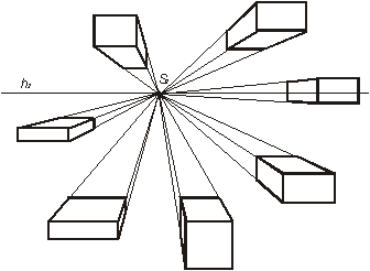
Drawing prisms in one point perspective


A prompt for Studio Task Week 9 - Of course your explorations will be far more rich than the quick prompt I have put here!
As it might be initially hard to visualize the perspective(s) you could also work off a sketch up model working in the hybrid analogue-digital mode. But try to draw them by hand as well.
http://www.wetcanvas.com/Community/images/14-Mar-2009/125922-One_Point_Perspective.JPG


art105-drawingdesign.blogspot.com


generativeart.com
http://arch1101-2010kjb.blogspot.com/2010/05/drawing-in-perspective.html

A good place to start is
Please browse this site to understand how the one point perspective can be set up and constructed


Monday, May 2, 2011

Experiment 3 - Week 9

Please see the following instructions for Week 9 Experiment 3


Have a look at the student examples on the link provided in Week 1 Task

http://www.russelllowe.com/arch1101_2011/experiment3/reference/ARCH1101_1PointPerspectives.pdf

Have a go at constructing one point perspectives manually if possible


One point perspective in Jerzy Michalski's paintings

Study for;
The Edge 2011
Study for;
The Square 2010-11
Red Gallery 2011
All images from http://www.colvillegallery.com.au
Some Images for your interest - Maybe not directly related to the Studio Task but a good sense of perspectival depth in painted impressions of the built environment


One point perspectives Renaissance

These are examples of one point perspectives from the Renaissance you are well aware of through the History Theory Lectures

Sunday, May 1, 2011

Comments from Experiment 1 - Strengths and Weaknesses

Comments from Experiment 1 – Apologies for the delay as this 'Task' got lost somewhere in the world of 'to do'. However, here it is and you can still learn from these comments as the Experiments are related as well as distinct from subsequent Experiments! The comments posted here closely correspond with those in your feedback sheet as I have reworded them to some degree for some students. Comments from Experiment 2 will be posted shortly after the marking process has been completed. Hope you all had a relaxing break!


Anu

_____________________

Renee

Incomplete submission but a good section

George

Section is good but needed more development as 3 distinct but related habitable spaces. Could have been improved by avoiding a three dimensional extrusion of the section. More exploration of stairs.

James

The submission is well handled and crafted carefully; the scheme shows equal attention to formal aspects as well as occupational aspects (scale and art work); and the section is 'enlarged' to an object and is not merely an extrusion.

Hayden C

Good blog and interesting final scheme ans it considers the interior occupation and is not just form based. However , the impact of crystalline forms on the interior is not always clear. The datum line is not articulated. The process work demonstrating development of the scheme is missing.

Michelle

complete, neat and well handled submission. The scheme could have been stronger through the exploration of the spaces below the datum more strongly. Could have been improved by avoiding a three dimensional extrusion of the section.

Alyse

Good hand drawings and strong ideas; However, a strong grasp on three dimensional sensibility was not demonstrated fully. Also the relation between the above and below the datum line needed to articulated and thought through. A lot more practice of sketch up was needed.

Daniel

Stair explorations were promising but not completely followed through. However, more studio application would have helped; Awareness of architectural precedents, conventions, and three dimensional visualisation needed to have been demonstrated; Engagement with the material presented in the course lecture would have helped; key weakness was the lack of articulation of relationship between below, above and datum line, and the occupation of the interior with respect to the artist/artwork.

Freddie

Some attention has been directed to interior spaces in terms of texture and occupation. Future submissions can be improved by paying more attention to architectural conventions and precedents discussed in the lecture, and by practising hand drawing and sketch up.

Matt

Distinctive approach to above, below, and datum level, and attention to display conditions and strong use of textures; submission could have been more complete (stairs) and hand drawings could improve.

Anthony

complete and methodical submission; strong sketch up exploration of interstitial spaces; however the datum level remains the weak point in establishing and mediating the relationship between above and below the datum line; stair explorations could have been more radical or experimental?

David

Struggled to understand the concept of the section as a cut through form which has an interior and an exterior; the final scheme shows attention to interior spaces but they do not delineate a relation between the datum, above and below; the shots of the sketch up model are truncated awkwardly.

Dean

Submission could have benefited from an awareness of architectural precedents, language, and conventions, and a demonstrable connection with the rich material presented in the course lectures; struggled to demonstrate an understanding of the section and develop that into a three dimensional object with an interior and exterior; Could have benefited from developing agility and competence in graphic and drawing skills.

Patrick

Strong interest in the interior and a reasonable grasp of the section; need to demonstrate willingness to experiment and test multiple strategies; sketch up skills could have been improved though hand drawings skills are good.

Robert

It is recommended that student produce a complete submission and demonstrate substantial studio work; Explorations ought to have a more disciplined formality to them, and they need to respond to the specific tasks set out for the experiment on a weekly basis.

Hayden W

A well handled submissions in terms of formality of exploration, strategies used, and presentation techniques; possible scope for improvement would have been a stronger use of textures in the interior.

Bryan

A complete and methodical submission; stair exploration could have been stronger; struggled to understand the sections as enclosing habitable spaces but nevertheless there is attention to interiority; could have been improved by demonstrating more awareness of architectural precedents and conventions.

Ed

A strong and complete submission; rigorous attention to requirements of the experiment; The only weaknesses was the three dimensional extrusion of the section as the building envelope which could have been strengthened by ascribing a sense of complexity and other nuances to the section; the stairs could have been designed and detailed to develop into architectural features; textures could have been used a little more imaginatively.

Dominik

Competence in visualisation of section in relation to datum line, and the notion of interior and exterior; the weakness was the limited exploration of the section; key strength of the scheme was the notion of the blurring of the datum line.

Amy

Struggled to understand the sections as enclosing habitable spaces and interior and exterior; more studio work needed to have been demonstrated; risk taking imaginative work recommended; a stronger demonstration of architectural precedents and conventions recommended as presented in lectures is recommended.

Frank

The below datum line could have been developed further; hand drawing could have been stronger as it demonstrates potential for improvement;

Wednesday, April 13, 2011

Reiterating Experiment 2

Reminding you all that

Choose a specific hypothesis related to two of the three clients listed above and create an architecture consisting of three spaces. The first two spaces should be at either end of a structure made from 10 interconnected rectangular forms. The third space should be on the landform that articulates a relationship to the rectangular forms. The spaces at either end of the rectangular forms are the clients laboratories (imagine the experiment to test your hypothesis will actually be conducted there). The space on the landform is a place for your clients to meet and exchange ideas. The landform should allow each client to arrive at their meeting in a distinctive and significant way.

Please consult lectures for Experiment 2

Hi all,

Please consult Russell's lectures as a necessity - You all need to be well acquainted with architectural discourse, precedents, conventions, and language.

Experiment 2

http://www.russelllowe.com/arch1101_2011/experiment2/reference/Lecture05_EXP2_LandForm_2011.pdf
http://www.russelllowe.com/arch1101_2011/experiment2/reference/lecture_06_electro_2011.pdf

Contacting Tutor

Hi all,

We have been in various stages of progress in Week 7 studio today but this was the only time we had for in person feedback. However, as you progress through the tasks by consulting the course page do feel free to post process work on your blogs and alert me to it. You could email me to alert me only if you have done so. Please do not use this email to ask make submissions!

Thank you.

Anu

Refer blog of peers

Dear Tute group,

Blogs to look at from within our group are:

http://edwardrosier.blogspot.com/
http://patritecture.blogspot.com/
http://dominikroth.blogspot.com/
http://frankmingchin.blogspot.com/

Anu

Tuesday, April 5, 2011

Week 6 Please complete

Please post the images from Crysis Wars environment for studio today!

Thank you.

Anu

Monday, April 4, 2011

Week 6

Hey tute group.

Reminder that you need to complete the following before this weeks tutorial.

1. In consultation with your tutor take one pair of axonometrics created in class and construct them in 3 dimensions using Google SketchUp.

2. Use the PlayUp plugin to export them to a custom environment you have created in Crysis Wars.

(Note; to do this the computer you use will have to have installed the Playup plugin, the Crysis Wars game, the Crysis Wars SDK and completed both of the tutorials below)

You can also find the tutorials here: Resources\samples\Arch\ARCH1101 - Lowe\Tutorials

3. Download 'Fraps' to capture two images from your Crysis Wars environment and upload them, along with the page from your sketchbook that you based it on, to your blog.

Note: make sure you save the Crysis Wars environment as you go along as it will be a part of your EXP2 submission. Use your student id number then _v01, _v02, _v03 to denote successive versions (saving over the top of your files won't help you when the last one you saved becomes corrupt!).

--
Dr Anuradha Chatterjee
Academic, Architecture Programme
Faculty of the Built Environment,
Red Centre West Wing,
University of New South Wales,
Sydney, NSW 2052
http://unsw.academia.edu/AnuradhaChatterjee

Sunday, April 3, 2011

Lecture Week 5

The lecture is uploaded
Please peruse!
Pay keen attention to the cultivation of the landform and the engagement of the built object with it and pay keen attention to the axonometrics.

Thanks

Anu

Tuesday, March 29, 2011

Works from Previous years


Works from Previous years
Please do not duplicate

Hypotheses

Maria Agnesi

Agnesi lived her life battling the norms of conventon

Agnesi owned a shovel and liked to dig!

Agnesi's life was part of a mathematical system of opposing differential and integral calculus.

Agnesi was made from a series of polygons.

'Susan' is the modern reincarnation of Agnesi.

Issac Newton

Newton was confident that curls get the girls!

If it wasnt for apples, we would still be floating in space.

Newton believed that the sun holds the power to the universe.

Every object has its own force of attraction.

Humans will deconstruct the earth through the overdevelopment of society.

Sigmund Freud

The mind is a prison.

Smoking increases the capacity to work.

Freud believed in the use of cocaine to heal physical and mental illness.

Freud believed he was an artificial construct.

The mind has another level when in hypnosis.

Saturday, March 26, 2011

Reiterating submission requirements

Dear Tute Group,

Trust all is proceeding well for the hand in Experiment 1 Sunday March 27 by 9:00pm.. Just to reiterate the assessment criteria and assessables we have been working with for and towards for the past 4 weeks you need to ensure your blog has the following:

ASSESSMENT CRITERIA

In addition to the overall course assessment criteria students will be assessed on the level and extent to which they engage with the criteria listed below:

THE THREE WORDS _ Do the three words work together to suggest a distinctive and significant approach to engaging with each artists work?
THE 18 SKETCH SECTIONS _ Do the 18 sketch sections communicate a distinctive and significant approach the student has taken with respect to the artists work and their relationship to the datum?
THE 36 CUSTOM TEXTURES _ Do the 36 custom textures demonstrate enquiry and experimentation with respect to ideas of measurement?
THE STAIR _ Does the stair demonstrate a distinctive and significant approach to bringing the completed artwork into the gallery?
THE ANIMATIONS AND ARCHITECTURE _ Do animations demonstrate that the student has thought about the relative size of each element, what their proportions are, their orientation, how texture and color map over their surfaces and how all of the above work together to establish the balance or otherwise of their scheme?


Complete by Sunday March 27 by 9:00pm.

1. Continue to develop your Sketchup model through to a high level of conceptual resolution. This model should include the best examples of your custom textures (remember, not all of the models geometry needs to be textured) and the scenes used to construct your animations.

2. Upload 3 images of your developed Sketchup model and the set of 2 dimensional section drawings from your notebooks to your blog. Include each materials name as a caption.

3. Create 3 short (15 second max) animations based on the points of view and sections discussed above. Use the export settings shown below.

Note: With video animation there are a great deal of options in terms of how a video is saved. In sketchup you can specify the frame size, the frame rate, the file type, the codec (compression and decompression type) and aspect ratio to name a few. For your animations in exp1 use the settings below.

3. Upload your final Sketchup model to Google Warehouse. Include "ARCH1101", "EXP1", "2011" and your "Full Name" as tags to your Google Warehouse uploads. See below for a tutorial on how to do this; the appropriate section is labeled "Share your models in the 3D Warehouse". http://sketchup.google.com/support/bin/answer.py?answer=37939&topic=9061

4. Upload the 3 short (15 second max) animations to YouTube and embed them in your blog. Include "ARCH1101", "EXP1", "2011" and your "Full Name" as tags to your YouTube uploads


Worthwhile having a look at the http://www.russelllowe.com/arch1101_2011/experiment1/reference/arch1101_marking_schedule_exp1.pdf


Good luck


Anu

Tuesday, March 22, 2011

Tasks to be completed before Studio Week 4

Hope you have all completed the following

36 words to describe material properties

Placed them into three categories

Made 36 material sections

Selected one of the two schemes for development

Apply the image of the artists work to simple shapes developed in Sketchup to approximate the size and scale of the artwork

Selected 3 of 36 textures developed and applied them to the Sketch up model selectively

I hope all this can be brought to the studio and/or uploaded to your blog.

Thanks

Anu


Tuesday, March 15, 2011

Learning Sketch up

Hi all,

Like most softwares expect a sense of intutive learning so does sketch up. As with drawing by hand is self taught and learnt through practice and observation so is sketch up. There are detailed video tutes online and I will find it surprising if most of you dont make use of them! They can be found on http://sketchup.google.com/training/videos/new_to_gsu.html

Good luck and see you in studio.

Anu

Week 3

Please post Tasks done in Studio and Independent Study for Week 2 ASAP!

Anu

Tuesday, March 8, 2011

WEEK 2 NOTE 2 SOME STAIRS...

The important think for you to think of is not just the form of the stairs but
Their rhythm – Pace of movement
Dimension, geometry and profile

Are they enclosed, exposed…
How their descend and ascend
Stairs mediate AND connect planes so think of them as a habitable threshold


https://blogger.googleusercontent.com/img/b/R29vZ2xl/AVvXsEh2nI-2nh8Q0Phu_H8fkFZbcZ8KpgiImil9ur-MMrSMcvyfcI2_p66qfK-bOdc0JgWeVfqmXFuHFJ8WyMcJplR6lHOmADcN_WRTMxukkzS9wghgi_DCGqaXnwPzBcJhDPhWtsvMQ_ISqJau/s1600/escher-stairs-g.gif
ESCHER STAIRS
http://www.hss.adelaide.edu.au/philosophy/inconsistent-images/piranesi/Piranesi_carceri%20XIV.jpg
PIRANESI'S IMAGINARIES ILLUSORY STAIRS
http://amazingdata.com/mediadata41/Image/fun_cool_offbeat_weird_origamic-architecture-sideways-steps_200908030750199640.jpg
PAPER STAIRS, SCORING, FOLDING

https://blogger.googleusercontent.com/img/b/R29vZ2xl/AVvXsEhEqCoC1n9WS0Wt6olP1O27lxKUGx0mw7awQWNhSOscOyxw0H-UUAImguja5gF9M-KNEXQmJfZ4UTZm4e-PVaUj-MYbJYSDloleprK1QaHhI6Hmvk8nP05gEqPBcjiykinKxo52gzUx9WV0/s1600/Laurentian+Library+Stair+-+View+2.jpg\
MICHAELANGELO'S LAURENTIAN LIBRARY STAIRS, FLUID
http://farm3.static.flickr.com/2008/1928244908_293c278d24.jpg
FUN STAIRS

Week 2 Note 1

Please upload your Google Sketch Up Sections ASAP

Frederick Kareh your blog address frederickkaren.blogspot.com does not work - Please let me know the correct address.

Amy Vickers your blog address amyvicky9922.blogspot.com does not work - Please let me know the correct address.

Anu